Overview Tab
The Overview tab is five summary cards and four charts. Read top to bottom, it goes from "how much" to "on what" to "which node".
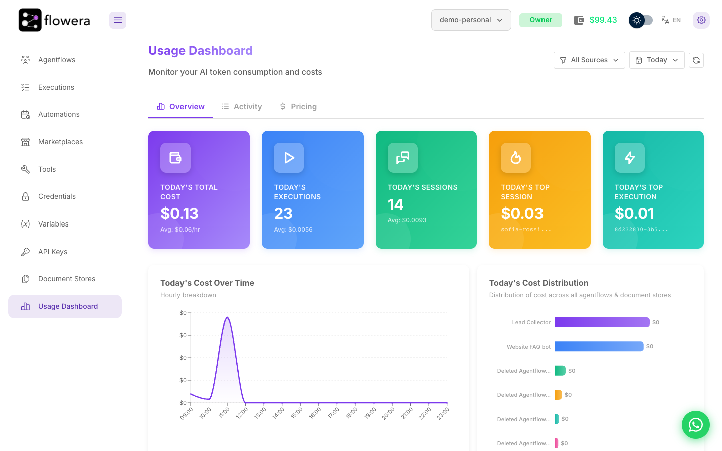
The summary cards
| Card | Shows | Useful for |
|---|---|---|
| Total cost | Spend in the selected range | The headline number |
| Executions | How many runs, and the average cost of one | Whether cost tracks volume |
| Sessions | How many conversations, and the average cost of one | The cost of a customer, not a message |
| Most expensive session | The priciest conversation, with its ID | Finding the outlier |
| Most expensive execution | The priciest single run | Finding the misconfigured node |
The relationship between the first two is the one to watch. Cost up and executions up is growth. Cost up and executions flat is a problem — the same traffic got more expensive, which usually means a prompt grew, a model changed, or a retrieval started returning more.
The Total cost card's subtitle adapts to the range: average per hour for Today, per day for a week or month, per month for All Time.
The two "most expensive" cards are the fastest route to a specific answer. They're a link into one concrete session or execution you can open and read.
With Document Stores selected as the source, the session cards disappear. Embedding operations aren't conversations, so a session count would be meaningless.
Cost over time
An area chart of spend across the range, with granularity chosen to fit: hourly for a day or two, daily for weeks, monthly for All Time. Gaps are filled with zeros so the axis stays continuous — a flat stretch means genuinely no spend, not missing data.
What to look for:
- A step change. Costs jumping on a specific day points at a deploy or a configuration change on that day.
- A spike. Almost always an automation or a batch campaign. Check the time against your schedules.
- A slow climb with flat traffic. Growing conversation history is the usual cause — memory settings are worth revisiting.
Cost distribution
A horizontal bar chart whose meaning depends on the source filter:
| Filter | Bars show |
|---|---|
| All Sources | The top 10 flows by cost |
| A specific flow | Cost by node type within that flow |
| Document Stores | The top 10 stores by embedding cost |
This is the drill-down that matters. Start on All Sources to find the expensive flow, click its bar, and the chart becomes cost by node — then by node name, so you're looking at one specific step rather than a category.
The usual finding: one Agent node with a large prompt, or a Retriever pulling more passages than the answer needs.
Activity charts
Two smaller charts beneath the distribution:
- Count over time — executions and sessions on one axis. Compare its shape against cost over time; where they diverge, cost per run changed.
- Average cost over time — average cost per execution and per session. This is the leading indicator. A rising average with steady volume is a configuration problem forming, and it shows here before the total gets alarming.
Both are hidden in Document Stores mode.
Related
- Activity tab — the runs behind these numbers
- Filters — what changes when you narrow the range or the source
- Execution time — the cost component that isn't tokens